
With the June update Adobe adds to its app Adobe Color added an extension so that the barrier-free accessibility of colours with regard to colour blindness can be checked and corrected directly during colour generation.
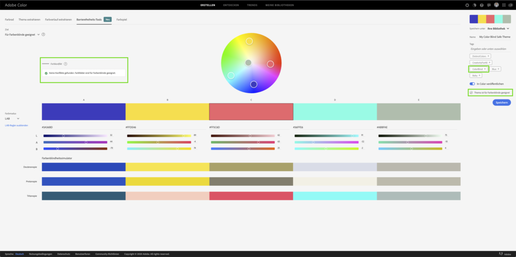
Colour vision deficiency, better known as colour blindness, affects about 3-5% of the world's population. There are three common types of colour blindness: protanopia, deuteranopia and tritanopia. Each of these deficiencies prevents people from distinguishing certain colours. Adobe Color can now make this process easier. With Adobe Color's new accessibility tools, a colour theme can be checked for these three types of deficiencies.
While Adobe Illustrator has a tool for checking this deficiency, this is not the case in InDesign. With the new extension in the Adobe Color web app, however, this deficiency is now remedied, at least for colour generation.

In the app, the new function is located in the "Accessibility Tools" tab. It is also possible to use a colour design already created in the Creative Cloud library. The simulator shows how the colour swatches are displayed for each type of defect for people who are colour blind.

By using the slider or dragging on the colour wheel, designated colours can be moved to correct this problem. The app then reacts to the changed colour scheme and gives the green light.
Let's hope that this development trend at Adobe will continue and that even more functions in Adobe Color will follow, such as a contrast check for accessible colour palettes.


